Instagram Story Dimensions 2026: Avoid Blurry Uploads

The correct Instagram Story dimensions are 1080 x 1920 pixels with a 9:16 aspect ratio. If you’re uploading anything else, you’re either forcing Instagram to resize it or leaving room for blur, awkward crops, or UI elements to cover your message.
That’s usually the problem people are trying to solve right now. The file looked fine before upload, then the Story went live and the text sits under the reply bar, the logo is too high, or the ad looks softer than expected on newer phones. The basic size is simple. The practical part is not. If you want Instagram Story dimensions that hold up in publishing, scheduling, and repurposing workflows, you need the canvas size, the safe zone, and the export settings working together.
Table of Contents
- Instagram Story Dimensions Quick Reference
- The Core 1080x1920 Pixel Resolution Explained
- Mastering the Instagram Story Safe Zone
- Video and Image File Specifications
- Recommended Export Settings for Perfect Clarity
- A Creator’s Workflow for Resizing Content
- Troubleshooting Common Story Dimension Issues
- Frequently Asked Questions
Instagram Story Dimensions Quick Reference
If you only need the numbers, use this setup.
| Element | Spec | Why it matters |
|---|---|---|
| Full canvas size | 1080 x 1920 pixels | Native Story frame for full-screen vertical display |
| Aspect ratio | 9:16 | Prevents side bars and odd cropping |
| Safe zone | 1080 x 1420 pixels | Keeps important text and branding visible |
| Top buffer | 250 pixels | Avoids profile area and Story UI |
| Bottom buffer | 250–340 pixels | Avoids reply bar, captions, and CTA overlays |
| Video length per Story card | 60 seconds | Longer videos need to be split |
| Frame rate | 23–60 fps | Keeps motion within platform specs |
| Image max file size | 30 MB | Larger files may fail or need compression |
| Video max file size | 4 GB | Useful limit for longer or higher-quality exports |
| Video codec | H.264 | Standard export format for delivery |
| Audio codec | AAC at 128 kbps+ | Keeps voice and music clean |
| Recommended video bitrate | 5,000–8,000 kbps | Helps avoid visible compression |
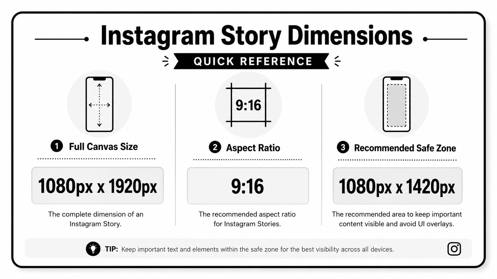
Practical rule: Build for the full canvas, design for the safe zone, and export for mobile compression.
The Core 1080x1920 Pixel Resolution Explained
Instagram Stories use a 1080 x 1920 pixel frame in a 9:16 aspect ratio, and that spec has stayed consistent since the format launched in August 2016, as outlined in Buffer’s Instagram image size guide.
That consistency is useful because it gives teams a fixed production target. You don’t need to guess between square, portrait, or horizontal orientation the way you might for feed assets. Stories are vertical. That’s the whole point. The format is built to fill the mobile screen.
Why this specific size works
A vertical full-screen frame removes distraction. There’s no extra margin around the creative, and there’s no need for the viewer to rotate the phone. For creators and marketers, that means the composition has to be intentional from the start.
Instagram may accept a minimum width of 500 pixels, but the same Buffer guide notes that going under the 1080px standard reduces visual quality on high-definition displays. In practice, that’s where you start seeing soft text, fuzzy logos, and footage that feels compressed before Instagram even applies its own processing.
What this means for repurposing
This also matters because Stories and Reels share the same 9:16 vertical framing. If you’re cutting a webinar, podcast clip, demo, or interview into short-form, you can use one vertical composition strategy across both placements. What doesn’t work is dropping widescreen footage into a Story as-is and hoping the platform fixes it for you. It won’t.
Mastering the Instagram Story Safe Zone
Most Story mistakes aren’t dimension mistakes. They’re placement mistakes.
You can have the correct canvas and still publish a bad Story if the CTA sits too low or the headline is tucked under the profile area. Instagram’s interface is always competing for space with your creative.
Where the interface gets in the way
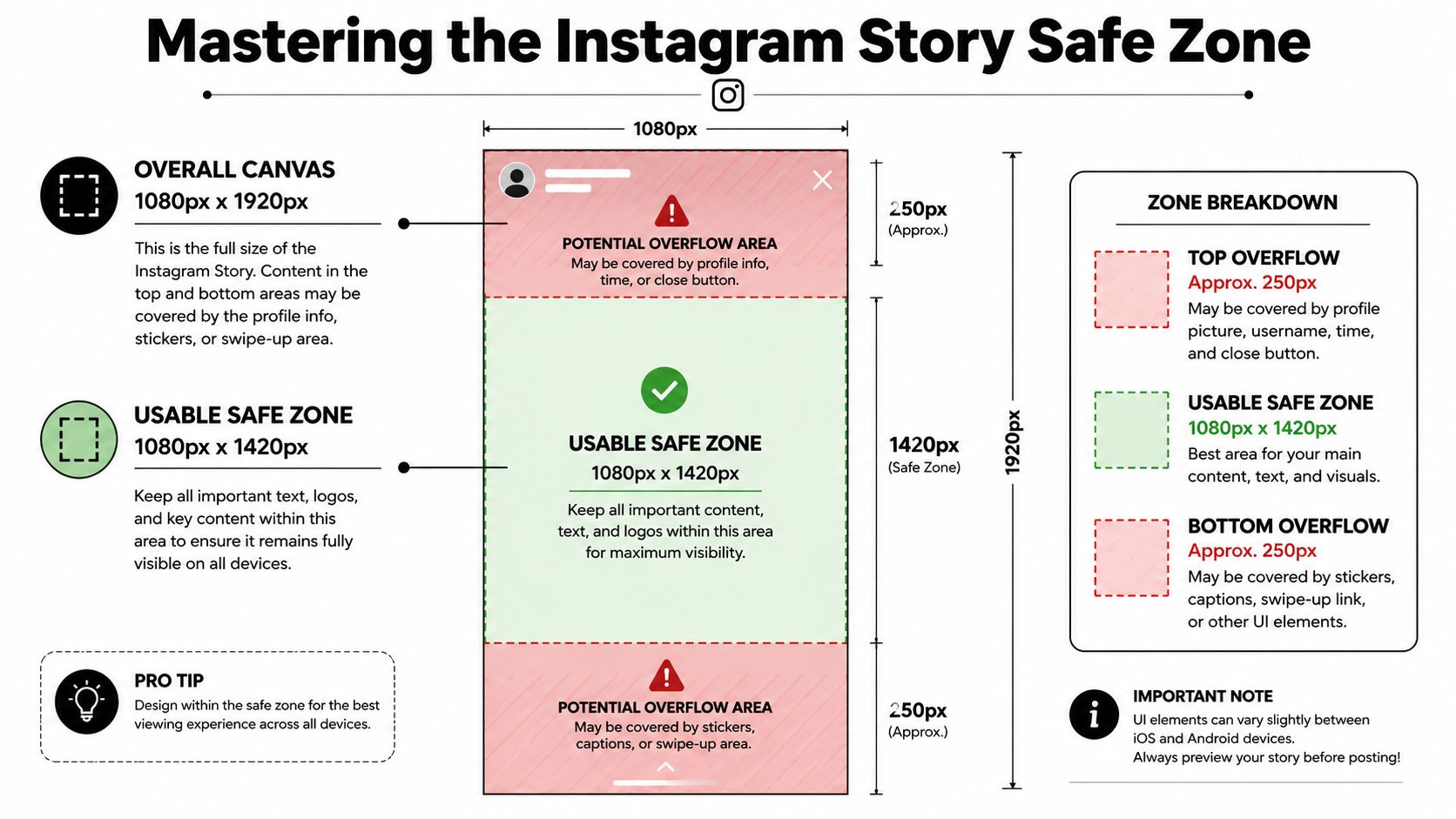
The usable safe area is 1080 x 1420 pixels, with a 250-pixel top margin and a 250–340 pixel bottom margin for key text, logos, and calls-to-action, according to this breakdown of Instagram Story specs.
That top area gets crowded by the profile picture, Story progress bar, and close button. The lower area is where captions, reply controls, and interaction prompts sit. If your key message lives there, viewers won’t see it clearly, and they definitely won’t act on it.
A related design issue shows up in thumbnails and cover-style assets too. If your team also handles adjacent visual formats, it’s worth aligning Story layouts with the same visibility-first thinking used in this guide to Instagram thumbnail size.
Here’s the layout to keep in mind before you publish:
- Top area: Leave it clean. Don’t park logos or opening text near the top edge.
- Center area: Put the headline, product shot, speaker framing, and main visual emphasis here.
- Bottom area: Treat it as risky space, especially for paid placements where CTA elements take over more of the screen.
A simple placement rule that saves rework
Keep all critical content in the middle band, and treat the upper and lower edges as decorative space only.
If a Story only works when the text touches the edge, the layout is too tight.
That one rule prevents most cut-off caption problems. It also matters for scheduled content, because overlays can render slightly differently depending on placement type and device behavior. Safe layouts survive those variables much better.
A quick visual reference helps when you’re reviewing placement before posting.
Video and Image File Specifications
Dimensions get the attention, but upload limits are where publishing problems usually show up.
What to keep in mind before upload
For Instagram Stories, video can run up to 60 seconds per Story card, frame rate should stay between 23–60 fps, images can be up to 30 MB, and video files can reach 4 GB, based on this Story dimensions reference.
Use those limits as planning constraints, not cleanup steps at the end.
- For static graphics: Export clean JPG or PNG files and watch file weight if you’re using layered visuals, screenshots, or dense text.
- For motion content: MP4 and MOV are the common delivery formats teams use when preparing Story-ready clips.
- For longer source material: Break the content into distinct Story cards instead of trying to force too much into one frame.
- For high-motion footage: Keep an eye on detail-heavy scenes. Fast cuts, text animation, and screen recordings tend to stress compression more than simple talking-head footage.
If you’re producing visual content regularly, especially for product demos or apparel creatives, this WearView guide to AI video is a useful companion read for thinking through how source footage quality affects the final social cut.
Recommended Export Settings for Perfect Clarity
A Story can look sharp in your editor and still come out soft on Instagram after upload. In practice, that usually comes from exporting a file that is already too compressed, too small, or misaligned to the final vertical canvas.
Settings that hold up after upload
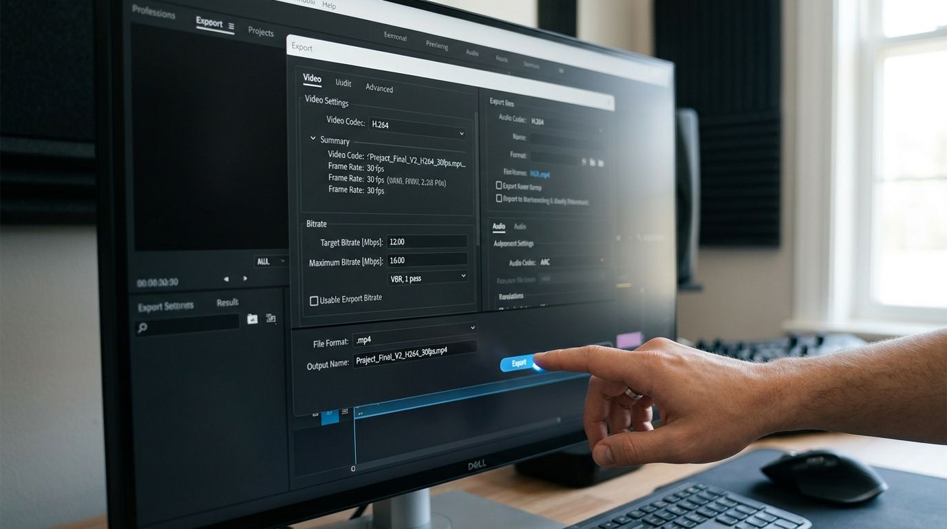
For Story exports, use H.264 video, AAC audio at 128 kbps or higher, and a recommended video bitrate of 5,000 to 8,000 kbps, as noted in SocialRails’ Instagram Stories size guide.
Use this as the default export preset:
- Codec: H.264
- Audio: AAC at 128 kbps or higher
- Bitrate target: 5,000 to 8,000 kbps
- Frame shape: Export in the final vertical Story format instead of cropping again later
Instagram re-processes every file. A clean export gives that second round of compression more to work with, which helps preserve text edges, gradients, and detail in motion-heavy clips.
One trade-off is file weight. Pushing bitrate too low creates obvious softness. Pushing it too high rarely buys much once Instagram compresses it again. The range above is a practical middle ground for Stories that need to stay crisp without creating bloated uploads.
Why these settings save quality during repurposing
Quality usually drops during handoffs. A webinar gets clipped, downloaded, resized, captioned, exported, then uploaded. Each step can shave off detail, especially on screen recordings, product demos, and clips with small on-screen text.
The fix is simple. Decide the final Story frame early, keep the subject inside the safe zone, and export one clean master for delivery. If the source is weak to begin with, this guide on improving video quality before export is a useful reference for tightening up footage before Instagram compresses it again.
If you’re converting webinars, podcasts, or interviews into Stories, quso.ai handles vertical reframing, auto-captions, and scheduling in one workflow. That helps teams reduce unnecessary re-exports, which is often where clarity starts to fall apart.
Clean exports protect good edits. Poor exports blur them, even when the framing is right.
A Creator’s Workflow for Resizing Content
It’s uncommon to start with vertical footage. The usual approach involves beginning with a webinar, interview, screen recording, or YouTube-style horizontal video and adjusting it for Stories.
How to reframe horizontal footage for Stories
Start with the subject, not the frame. Ask what absolutely needs to stay visible. If it’s a face, keep the eyes in the upper-middle portion of the vertical crop. If it’s a product demo, center the action where captions won’t compete with it.
A practical workflow looks like this:
- Pick the moment first. Find the strongest clip before you think about layout.
- Crop to vertical around the focal point. Don’t center the original frame by default. Most horizontal footage has dead space on both sides.
- Test caption space early. If subtitles cover the speaker’s mouth or the product UI, the crop is wrong.
- Use movement carefully. Panning across a horizontal shot can work, but only if the motion feels intentional and not like a rescue job.
- Review on a phone. Desktop previews hide a lot of problems that become obvious on mobile.
If your team does this regularly, build a repeatable reframing checklist around speaker position, caption area, and CTA placement. This walkthrough on how to repurpose video content is useful for structuring that process across multiple social formats.
Troubleshooting Common Story Dimension Issues
When a Story looks wrong, Instagram compression is often blamed. Sometimes that’s true. Often it’s the wrong diagnosis.
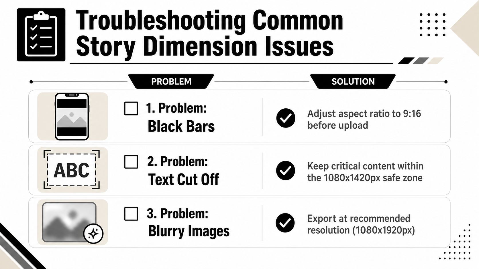
What causes black bars, cut-off text, and soft ads
Here’s the fast troubleshooting version:
- Black bars on the sides: Your asset isn’t 9:16. Resize before upload instead of letting Instagram pad it.
- Text or logo gets cut off: The content is outside the safe area. Rebuild the layout, not just the export.
- The video looks soft after posting: Check source resolution and export settings first.
- The ad looks blurry on newer devices: This is the one most guides miss.
According to AITouch’s Instagram Story ratio guide, while 99% of content covers the standard 1080×1920px size, there’s a more demanding 1440×2560px requirement specifically for high-density Story Ads on newer devices. That’s a real distinction for paid media teams. If an ad looks softer than the organic version, the issue may be resolution mismatch rather than ordinary platform compression.
Don’t assume every blurry Story is an encoding problem. Sometimes the placement needed a higher-resolution ad asset from the start.
This also shows up when profile images, speaker framing, or brand portraits feel weak after cropping. If your creative relies heavily on the subject’s face, studying composition examples like this guide to noticeable headshots can help you build vertical crops that still read clearly in a fast-scrolling environment.
Frequently Asked Questions
Can I post a 4:5 video to Instagram Stories?
Yes, but it is a compromise. Stories are built for a full-screen 9:16 frame, so a 4:5 video will either crop, sit with padding, or feel visually smaller than native Story content. If the clip matters, resize it before upload and reframe the subject manually.
Do Stories and Reels use different dimensions?
They use the same 9:16 canvas at 1080 x 1920. The practical difference is composition. A Story has more interface overlap, so a layout that works in Reels can still cover captions, stickers, or calls to action in Stories.
Why does my Story text get hidden?
Instagram’s interface takes space at the top and bottom of the frame. Keep headlines, logos, subtitles, and buttons inside the 1080 x 1420 safe zone so they stay visible across devices and placements.
What’s the max length for one Instagram Story video?
One Story card can run up to 60 seconds. For longer clips, split the content into separate cards and make sure each one still works on its own.
Are Story ad dimensions different from organic Story dimensions?
The base format stays 9:16, but ad creative needs tighter execution. Leave room for the lower CTA area, and for newer high-density placements, prepare a 1440 x 2560 version if sharpness matters. That extra resolution is easy to skip, and it is one of the main reasons paid Story creative can look softer than the organic version built from the same source.