Instagram Thumbnail Size: A 2026 Guide for All Formats
Instagram thumbnail size: the short answer
Use 1080 x 1440 px (3:4) for feed post thumbnails and 1080 x 1920 px (9:16) for Reels covers. 3:4 is now the tallest photo shape Instagram keeps at full resolution, and it matches the 3:4 tiles on the profile grid, so nothing gets cropped there. The older 1080 x 1350 px (4:5) still works. For Reels, Instagram’s own recommendation for the cover photo is 420 x 654 px (a 1:1.55 ratio), and its help center says you can’t edit a cover photo after you’ve uploaded it, so get it right before you post. Keep text and faces in the center: the feed, the Reels tab and the grid each crop the same thumbnail differently.
Sizes checked against Instagram’s Help Center articles on photo resolution and Reel sizes on October 20, 2026.
If your thumbnail only works in one placement, it’s not finished.
Most thumbnail mistakes don’t come from using the wrong export size; they come from designing for one screen and forgetting that Instagram shows the same asset differently in the feed, the Reels tab, and the profile grid. That’s where text gets chopped, logos drift too close to the edge, and a solid cover turns into a rework request five minutes before scheduling.
Table of Contents
- What is a thumbnail on Instagram?
- Instagram Thumbnail Size The Only Numbers You Need
- Quick Reference Chart for All Instagram Thumbnail Sizes
- Feed Post Thumbnail Size and Grid Preview
- Reels Cover Size The Ultimate Safe Zone Guide
- Story and Highlight Cover Dimensions
- Profile Picture Size and Best Practices
- How to Create a Universal Thumbnail That Works Everywhere
- Design Best Practices for High-Impact Thumbnails
- Frequently Asked Questions About Instagram Thumbnails
- Why does my Instagram thumbnail look blurry after upload?
- What is the new Instagram thumbnail size in 2026?
- Can I change an Instagram thumbnail after posting?
- What is the best image size for Instagram?
- How do I post a 9:16 photo on Instagram?
- What’s the best file type for an Instagram thumbnail?
- Should I put text on a Reel cover?
- What’s the biggest thumbnail mistake teams make?
What is a thumbnail on Instagram?
A thumbnail is the small preview image people see before they open your post. For a photo, it’s the photo itself, cropped to fit the profile grid. For a Reel, it’s the cover you pick (a frame from the video or an image you upload), which shows on your profile, in the Reels tab and in the feed. The thumbnail decides whether someone taps.
Instagram Thumbnail Size The Only Numbers You Need
For many teams, the working spec sheet is simple.
A feed post works best at 1080 x 1440 px in a 3:4 ratio, the tallest shape Instagram supports for photos; 1080 x 1350 px (4:5) is the older standard and still uploads at full resolution. A Reels cover should be built at 1080 x 1920 px in a 9:16 ratio. A profile picture should be uploaded as a square at at least 320 x 320 px.
That gets you through export. It doesn’t get you through publishing.
The main issue is display logic. Instagram doesn’t show every asset the same way everywhere, so a thumbnail that looks clean in the editor can lose its headline in the feed preview or cut off a logo on the profile grid.
Practical rule: Don’t approve a thumbnail until you’ve checked how the same image survives every crop that matters.
For those managing creator, SaaS, or B2B content, the majority of wasted time stems from challenges like these. The dimensions are easy. The crop behavior is what causes revisions.
Quick Reference Chart for All Instagram Thumbnail Sizes
Below is the reference chart worth bookmarking. If your team also manages multiple platforms and wants another good example of placement-specific creative constraints, this guide on how to avoid Reddit ad production problems is useful for the same reason: the specs matter, but the display behavior matters more.
Instagram Thumbnail and Image Sizes 2026
| Placement | Recommended Dimensions (Pixels) | Aspect Ratio | Key Notes |
|---|---|---|---|
| Feed Post (tallest) | 1080 x 1440 | 3:4 | Tallest photo ratio Instagram keeps at full resolution; fills the grid tile |
| Feed Post (classic portrait) | 1080 x 1350 | 4:5 | Still supported; trimmed slightly at the sides on the 3:4 grid |
| Landscape Post | 1080 x 566 | 1.91:1 | Widest supported photo ratio |
| Profile Grid Preview for Posts | 1080 x 1440 | 3:4 | Profile grid preview is taller than the old square standard |
| Reel Cover Upload | 1080 x 1920 | 9:16 | Best for full vertical cover design |
| Reel Cover (Instagram’s recommendation) | 420 x 654 | 1:1.55 | Instagram’s stated cover-photo size; can’t be edited after upload |
| Reel Feed Preview | 1080 x 1350 | 4:5 | Reel cover is cropped in the main feed |
| Profile Picture | at least 320 x 320 | 1:1 | Upload square, displayed as a circle |
Feed Post Thumbnail Size and Grid Preview
For feed posts, upload at 1080 x 1440 px in 3:4. Instagram’s help center says it keeps a photo at its original resolution when the width is between 320 and 1080 px and the aspect ratio is between 1.91:1 and 3:4, which works out to a height of 566 to 1440 px at full width. Anything taller gets cropped to fit.
That’s a recent change. The 3:4 limit lines up with the profile grid, which switched from squares to 3:4 tiles, so a 1080 x 1440 post now shows the same picture in the feed and on your profile. A 4:5 post (1080 x 1350) still works, but the grid trims a little from its sides, as Sphere Agency’s Instagram size guide also notes.
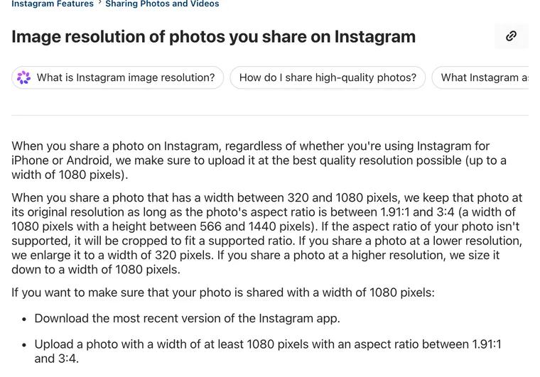 Instagram’s own limits for photos: 1.91:1 to 3:4, up to 1080 px wide. Screenshot of Instagram Help Center, October 20, 2026.
What this changes in practice
Older workflows assumed the grid was square-first. That’s outdated.
If your team still places text right at the top or bottom edge of a portrait post, you’ll eventually lose something important in the profile view. This is especially common with educational carousels, quote graphics, and video covers exported as feed posts.
- Keep headlines centered: Don’t anchor key copy too high or too low.
- Avoid edge branding: Corner logos often look fine in the composition view and weak in the grid.
- Check the profile before sign-off: That’s where the visual library has to hold together.
For teams building templates, it helps to compare this with a dedicated guide to Instagram square dimensions, especially if older brand systems still assume a square-first grid.
If the post is meant to drive profile clicks later, the grid preview matters as much as the feed view.
Reels Cover Size The Ultimate Safe Zone Guide
A Reel cover is the hardest Instagram thumbnail to get right because one file has to survive multiple placements.
The upload spec is 1080 x 1920 px in 9:16, which matches the full vertical Reel format and gives you enough room to build a proper title card, face crop, or branded opener.
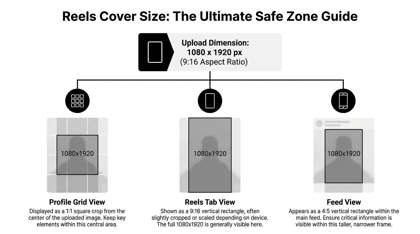
How one cover gets cropped three ways
A Reel cover uploaded at 1080 x 1920 px gets cropped to 1080 x 1350 px in the main feed. That means your cover can be technically correct and still hide the most important words once it appears in-feed, as outlined in Buffer’s Instagram image size guide.
That’s the core safe-zone problem. You’re not designing one static poster. You’re designing a vertical asset that has to hold up in different windows.
Instagram’s help center gives a separate, smaller number for the cover photo itself: 420 x 654 px, a 1:1.55 ratio. Treat it as the minimum shape, not the export size. A 1080 x 1920 cover with the important part in the center satisfies both. The same article says reels can be anywhere from 1.91:1 to 9:16, need at least 30 FPS and 720 pixels, and that you currently can’t edit a cover photo after uploading it.
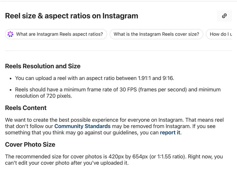 Reel specs and the cover-photo size, straight from Instagram. Screenshot of Instagram Help Center, October 20, 2026.
Where to place text and branding
Put your main headline, face crop, and branding in the center of the vertical canvas. Not near the top edge. Not sitting on the bottom frame.
When teams miss this, the usual failures are predictable:
- Top-loaded titles: The first line disappears or feels cramped once the feed crop hits.
- Bottom-heavy captions: The visual hook gets pushed too low and loses urgency.
- Wide compositions: A subject framed for full-screen vertical can feel oddly cut in smaller previews.
A simple operating rule works well:
Keep the key message in the middle of the cover, and treat everything near the outer edges as optional.
Here’s a walkthrough worth watching if you want the layout logic in a more visual format.
A free crop and safe-zone template for Reels, from video production channel Film Bodega.
If you’re standardizing templates for short-form production, keep a separate reference for Instagram Reel dimensions so the cover design and the video export spec don’t drift apart.
Story and Highlight Cover Dimensions
Stories use the same vertical canvas as Reels. Build them at 1080 x 1920 px in 9:16.
That part is easy. The design choices are where people get sloppy.
What works for Stories
Stories move fast and sit under Instagram UI. If you stack text too close to the top or put a callout too low, the interface competes with your content, so for operators the fix is straightforward: keep the message centered and leave breathing room around it.
This matters more for repurposed clips than for native phone-shot Stories. Repurposed assets often arrive with captions, lower-thirds, or speaker names already occupying the frame, so there’s less room for mistakes.
What changes for Highlights
Highlight covers live on your profile and get displayed as circles. That means the corners of a square design are functionally dead space.
Use a simple icon, short initial, or centered mark. Don’t treat a Highlight cover like a mini poster. If the design needs the edges to make sense, it won’t survive the circular crop.
- Center the symbol: Keep the focal element in the middle.
- Skip tiny text: Highlight covers are too small for detailed words.
- Use clean contrast: Simple shapes hold up better than thin outlines.
Profile Picture Size and Best Practices
Instagram profile photos should be uploaded as a square at at least 320 x 320 px, and Instagram crops them into a circle, according to Hootsuite’s image size guide.
That means logos with small edge details, thin borders, or long wordmarks usually underperform as avatars. The platform won’t show the square you uploaded. It shows the circular crop.
A good rule is to test your avatar at tiny size before publishing. If you want examples of what makes a profile image stay recognizable, these Sup Growth tips for profile pictures are a useful reference.
How to Create a Universal Thumbnail That Works Everywhere
The cleanest workflow is to build one master thumbnail that survives the likely crops instead of making separate versions for every placement.
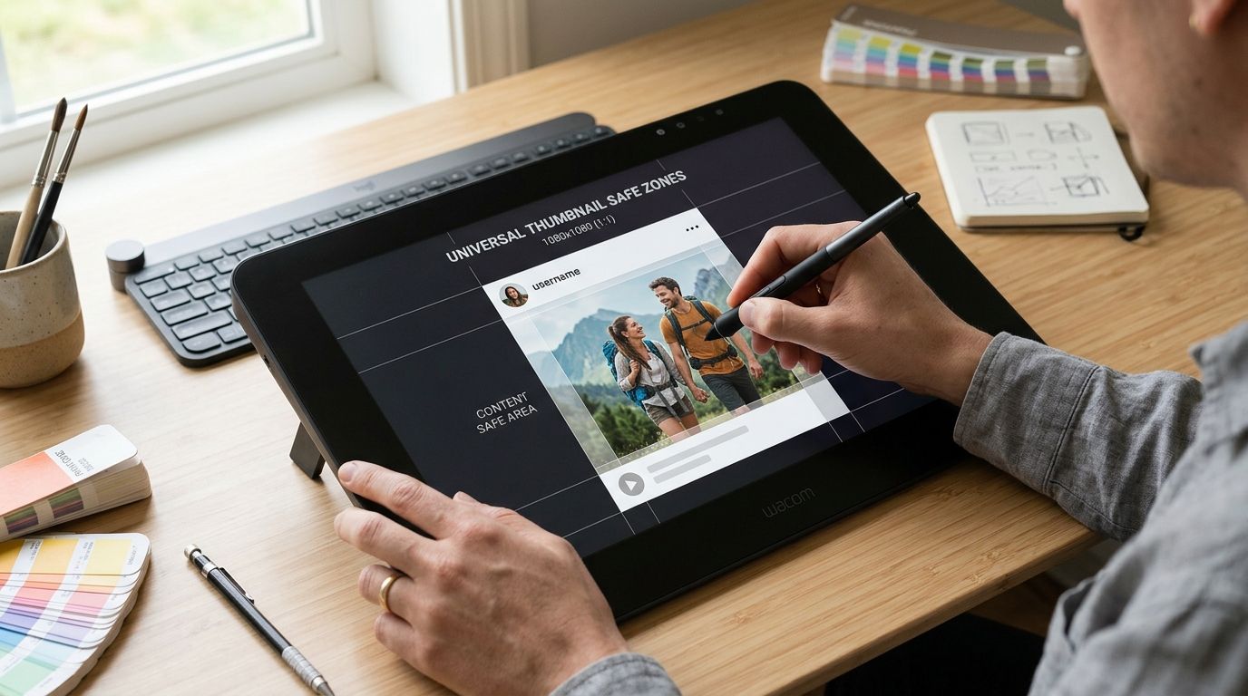
Build on a vertical master canvas
Start with a 1080 x 1920 px vertical canvas for video-related thumbnails. That gives you the largest working area and keeps the asset aligned with short-form production.
Then overlay your internal guides for the placements that matter most:
- Full vertical view: Your base Reel or Story frame
- Feed preview view: The area likely to be seen in the main feed
- Grid preview view: The central area that still reads in profile browsing
This is the same mindset good YouTube teams use when building around crop-safe compositions. If you’ve worked on YouTube thumbnail size, the principle is familiar. Design for the actual display, not the raw export.
Treat the center as your real layout area
Most failures happen because designers use the whole canvas as if every pixel has equal importance. It doesn’t.
Your real layout area is the center. That’s where the face, hook, title, and recognizable brand element should live. Background texture, secondary graphics, and supporting shapes can expand outward from there.
Use this working sequence:
- Lock the focal point first: Choose the frame, face, product shot, or visual moment that still reads when cropped.
- Place the title second: Keep it short and central. Don’t wrap copy into a tall text stack unless the design absolutely needs it.
- Add brand last: A subtle logo or color system is enough. Heavy branded furniture often creates more crop risk than value.
A thumbnail should still make sense when Instagram removes the outer parts you were attached to.
If your team repurposes long-form video into short clips, the practical win is simple. Pick the cover while you’re still reviewing the clip, not after captions, export, and scheduling are already done. That avoids the usual backtracking.
Design Best Practices for High-Impact Thumbnails
Correct dimensions stop errors. They don’t make people tap.
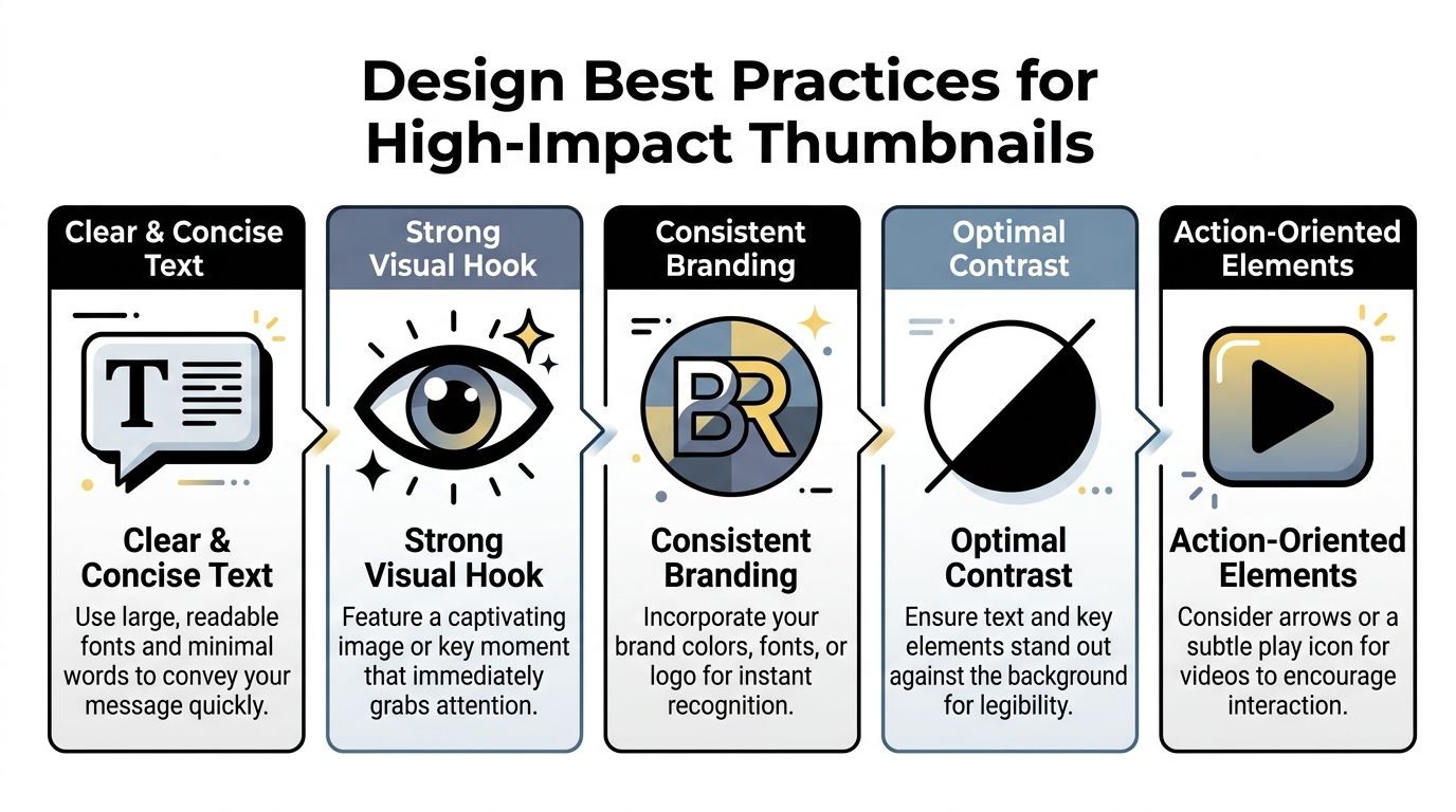
Make the message readable first
A thumbnail has one job: communicate the idea quickly.
That usually means fewer words, larger type, and a stronger focal image. If a viewer has to decode the layout, the cover is doing too much. This shows up a lot in B2B content where teams try to cram a headline, subtitle, logo, URL, and speaker name into one frame.
Use a tighter system instead:
- Lead with one clear phrase: Short beats detailed.
- Use strong contrast: Light text on a muddy frame disappears fast.
- Choose a decisive frame: Expression, gesture, or a clear visual moment beats a generic still.
Keep the grid visually consistent
A single strong thumbnail helps one post. A consistent system helps the whole profile.
That doesn’t mean every cover should look identical. It means the viewer should recognize your content rhythm. Similar type treatment, repeated color logic, and consistent framing create a profile that feels managed instead of random.
Good thumbnails don’t just win the click. They make the profile library look worth exploring.
For social teams, that usually means creating two or three cover templates, not ten. Enough variety to avoid monotony. Enough consistency to keep the grid coherent.
Frequently Asked Questions About Instagram Thumbnails
Why does my Instagram thumbnail look blurry after upload?
Usually because the uploaded asset is too small, over-compressed before upload, or wasn’t built for Instagram’s native display sizes. Photos wider than 1080 px are scaled down and anything under 320 px wide is enlarged, so export at exactly 1080 px wide. For Reels covers, using the full 1080 x 1920 px size is the safer working choice for quality retention. Instagram also has an Upload at highest quality toggle under Settings > Media quality.
Can I change an Instagram thumbnail after posting?
For a Reel, Instagram’s help center says no: “Right now, you can’t edit your cover photo after you’ve uploaded it.” For a photo post, the thumbnail is the photo, so changing it means editing or reposting the photo. Pick the cover before you share, per the Instagram Help Center page on Reel sizes.
What is the new Instagram thumbnail size in 2026?
1080 x 1440 px (3:4) for feed posts, because Instagram now keeps photos up to a 3:4 ratio at full resolution and the profile grid uses 3:4 tiles. Reels covers stay at 1080 x 1920 px (9:16), with Instagram recommending at least a 420 x 654 px cover photo.
What is the best image size for Instagram?
1080 px wide. Use 1080 x 1440 (3:4) for portrait posts, 1080 x 1080 (1:1) for squares, 1080 x 566 (1.91:1) for landscape, and 1080 x 1920 (9:16) for Stories and Reels.
How do I post a 9:16 photo on Instagram?
Not as a normal feed photo: Instagram crops photos taller than 3:4. Share a 9:16 image as a Story, or turn it into a Reel, where 9:16 is the native shape. For the feed, crop it to 3:4 (1080 x 1440) yourself so you choose what stays in frame.
What’s the best file type for an Instagram thumbnail?
Use the format that keeps text and visuals clean without introducing obvious artifacts. In practice, teams usually compare exports and keep the version that stays sharper after upload.
Should I put text on a Reel cover?
Yes, if the text is short and placed in the central safe area. Long headlines near the outer edges are where most cover failures happen.
What’s the biggest thumbnail mistake teams make?
Designing for the editor preview instead of the actual Instagram placements. A thumbnail that only looks right in one view isn’t production-ready.
If you’re turning podcasts, webinars, interviews, or YouTube videos into short clips, quso.ai helps you repurpose the footage, add captions, and schedule posts with its Instagram scheduler on the Essential and Growth plans, without losing control of the final cover. It’s a practical way to reduce the thumbnail rework that usually shows up at the end of the workflow.