Instagram Square Dimensions: The 2026 Quick Guide
Use 1080 x 1080 pixels for an Instagram square post. That's still the correct 1:1 format, even though Instagram feed posts can also be published in other orientations, like portrait, which is why many creators now ask a better question than “what size is square?” They ask whether square is still the right choice at all.
If you're editing a post right now and staring at export settings, this is usually where the confusion starts. You've got a finished image, but then you have to decide between square, portrait, width requirements, compression, and whether your design will still look clean on the profile grid. The number is easy. The strategy isn't.
Square is still useful because it's predictable, easy to compose, and safe across devices. But safe and optimal aren't always the same thing in 2026. Some posts should stay square. Others should absolutely use a taller format.
Table of Contents
Your Quick Answer to Instagram Square Dimensions
If your goal is a standard square feed post, export at 1080 x 1080 pixels. That's the current square baseline creators should use when they want a clean 1:1 image that holds up well in-feed.
This is the setting to use when you want the least friction. It's the easiest format for quote cards, product images, centered graphics, and brand templates that need to stay consistent from post to post. If you're unsure what to choose, square is still the safest starting point.
Where people get stuck is assuming the right size automatically means the right strategy. It doesn't. Instagram supports more than one feed shape, and each one changes how your post occupies space, how it gets cropped, and how much control you keep over composition.
If you want a broader feed sizing reference beyond square alone, this Instagram post size guide is a useful companion.
Practical rule: Use square when consistency matters most. Switch formats only when the creative clearly benefits from more height or width.
Instagram Square Post Quick Reference Guide
Here's the compact version most creators need.
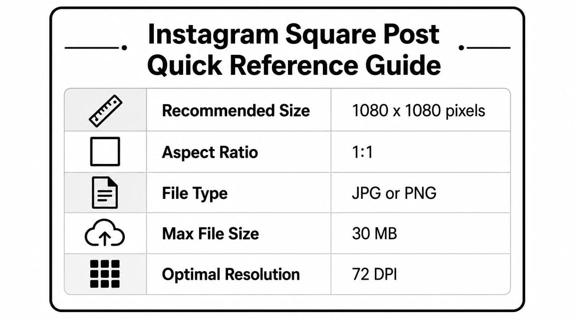
| Specification | Recommendation |
|---|---|
| Recommended size | 1080 x 1080 pixels |
| Aspect ratio | 1:1 |
| File type | JPG or PNG |
| Max file size | 30 MB |
| Optimal resolution | 72 DPI |
A few of those settings need context. 1080 x 1080 is the core sizing choice. 1:1 means the width and height match exactly. JPG is usually the practical pick for photos, while PNG makes more sense for graphics that need cleaner edges, logos, or transparency.
The file size and DPI settings belong to your export checklist, not your creative strategy. What matters most is that the image starts with the right canvas and reaches Instagram with enough quality that compression doesn't wreck the final result.
Understanding the Official Square Dimensions Specs
Instagram's official square spec for feed posts is 1080 × 1080 pixels at a 1:1 aspect ratio, and Instagram also allows feed images from 1.91:1 to 4:5. The platform's help guidance recommends uploading photos at at least 1080 px wide for best resolution, which is why square posts should be built to full width instead of exported smaller and left for Instagram to fix later. See Instagram's feed photo sizing guidance.
What 1 to 1 actually means
A 1:1 aspect ratio means your image is as tall as it is wide. If the width is 1080 pixels, the height is also 1080 pixels. Think of it as a perfect digital square.
That matters because Instagram doesn't just store your image. It fits that image into feed layouts, previews, and profile contexts. If your canvas isn't square, the app may crop or reframe it in ways you didn't intend.
Recommended size versus accepted size
Creators often confuse “Instagram accepts it” with “Instagram will display it well.” Those are different standards.
A smaller square file might upload, but if it's below the width Instagram wants for crisp rendering, you're giving the platform weak source material. That usually shows up as softness, fuzzy text, or edges that don't look clean after compression.
Uploading the minimum is how creators end up blaming Instagram for a quality problem they created at export.
JPG versus PNG
Use the file type based on the design, not habit.
JPG for photos: Better for lifestyle images, portraits, product shots, and anything with natural gradients or complex color.
PNG for graphics: Better for text-heavy posts, flat-color designs, logos, and simple visual assets where edge clarity matters.
Choose before export: Don't design in one format and switch casually at the end. The asset type should shape the export choice.
If you manage a lot of social creatives, by standardizing square templates before anyone opens Instagram, teams save time.
Why 1080px Is the Magic Number for Instagram
The short version is simple. 1080 pixels wide gives Instagram enough image data to render a feed post cleanly after compression. Smaller files force the platform to do more corrective work, and that's when sharp images start looking soft.
Upload size and display size aren't the same thing
Creators often say, “Instagram compresses everything anyway, so why bother?” Because compression doesn't cancel out source quality. It makes source quality matter more.
When you upload an image that already matches Instagram's expected width, you give the platform a properly sized master to process. When you upload something smaller, Instagram may need to enlarge or reinterpret it. That's where blur, pixelation, and muddy text show up.
Why the standard settled here
Instagram's square sizing didn't always revolve around today's standard. PowerReviews notes that older recommendations included 1936 x 1936 pixels and a minimum of 600 x 600 pixels, but current guidance has largely settled around 1080 x 1080 pixels as the practical upload norm for square posts across major publishing guides. That shift reflects a more consistent standard for device display and post-compression quality, as outlined in this Instagram sizing history reference.
That history matters because it explains why creators still hear mixed advice. Some older tutorials were written around earlier recommendations. The current norm is tighter and more consistent.
What works in practice
Three habits usually keep square posts looking clean:
Export to final size first: Don't send giant originals and hope for a better result.
Keep text readable at mobile size: Compression punishes thin fonts and tiny type.
Use sharp source assets: A correct canvas won't rescue a weak original photo.
If a square post looks bad, the problem usually starts before upload.
Square vs Portrait Posts Which Is Better in 2026
The better format depends on what the post needs to do.
Square still works. It's familiar, controlled, and easy to design around. But if your only reason for choosing it is “that's what Instagram posts are supposed to look like,” that's outdated thinking.
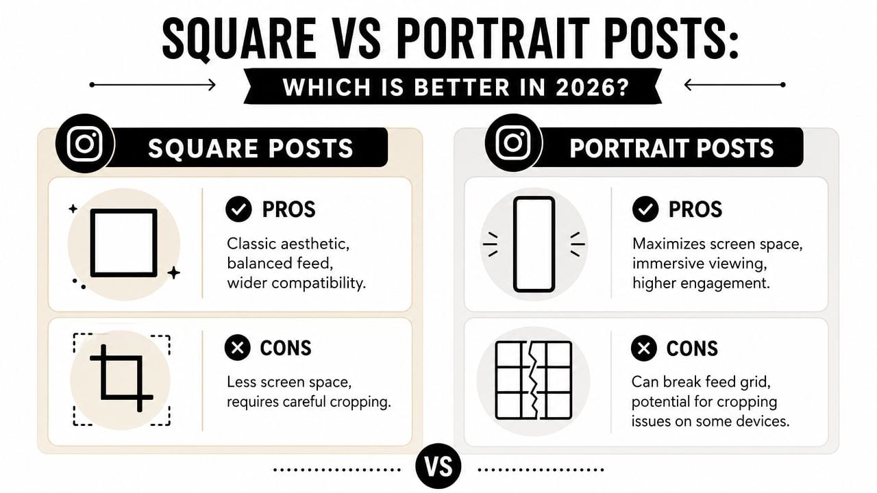
According to Adobe Express, square posts are still common, and analysis cited by Dash Social found that square posts made up 56% of analyzed Instagram images. But the same Adobe guidance argues that the “era of square-first content is over” because 4:5 portrait posts at 1080 x 1350 px take up more screen space on mobile. You can review that framing in Adobe's Instagram size guide.
When square is the better choice
Square is still the cleaner choice when layout discipline matters more than feed dominance.
Template-based branding: Great for recurring series, testimonials, quote cards, and educational tiles.
Centered composition: Useful when the subject sits naturally in the middle and doesn't need vertical room.
Cross-use flexibility: Easier to reuse across platforms, decks, internal assets, and simple grids.
When portrait usually wins
Portrait is usually stronger when attention is the goal. It occupies more of the phone screen, which gives your image more visual weight during fast scrolling.
That matters for:
Faces and people-first creatives
Educational carousels and dense visual explainers
Product posts that need more room for detail
Square is the safe default. Portrait is often the more aggressive one.
If you're building a broader social sizing system, this social media image sizes guide helps map where each format fits.
The practical decision
Use square by default only when consistency is part of the brand experience. Otherwise, choose the aspect ratio that gives the content the right amount of room. In many feed campaigns, that means portrait gets the first look and square has to justify itself.
Common Mistakes to Avoid With Square Images
Most square-post problems aren't algorithm problems. They're preparation problems.
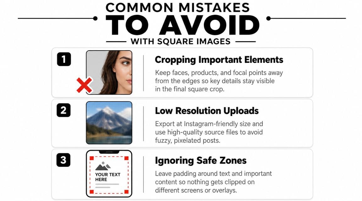
Letting Instagram crop for you
If your image wasn't designed as a true square from the start, Instagram may center it in a way that cuts off a face, product edge, or headline.
The fix is simple. Crop intentionally before upload. Build the square canvas first, then move the subject where you want it. Don't rely on app-level cropping to make editorial decisions for you.
Uploading low-resolution files
A lot of blurry posts start with screenshots, resized exports, or assets pulled from chat threads and reused too many times. By the time they reach Instagram, there isn't enough quality left.
Use the final square canvas from the original design tool. Don't export small, then enlarge later.
Ignoring edge safety
Square is forgiving, but it isn't unlimited. Text, logos, and key product details still need breathing room. If elements sit too close to the border, they can feel cramped in-feed and become more vulnerable in alternate preview contexts.
Leave room around the edges. A technically correct square can still feel badly composed.
A simple pre-publish check catches most of this:
Check the crop: Make sure the focal point survives center framing.
Check the text size: Read it at phone size, not zoomed in on desktop.
Check the edges: Pull logos, faces, and key words slightly inward.
Creators who do this consistently waste far less time fixing preventable mistakes after posting.
How to Crop and Export Perfect Square Images
If you want square posts that stay sharp, the workflow matters as much as the dimensions.
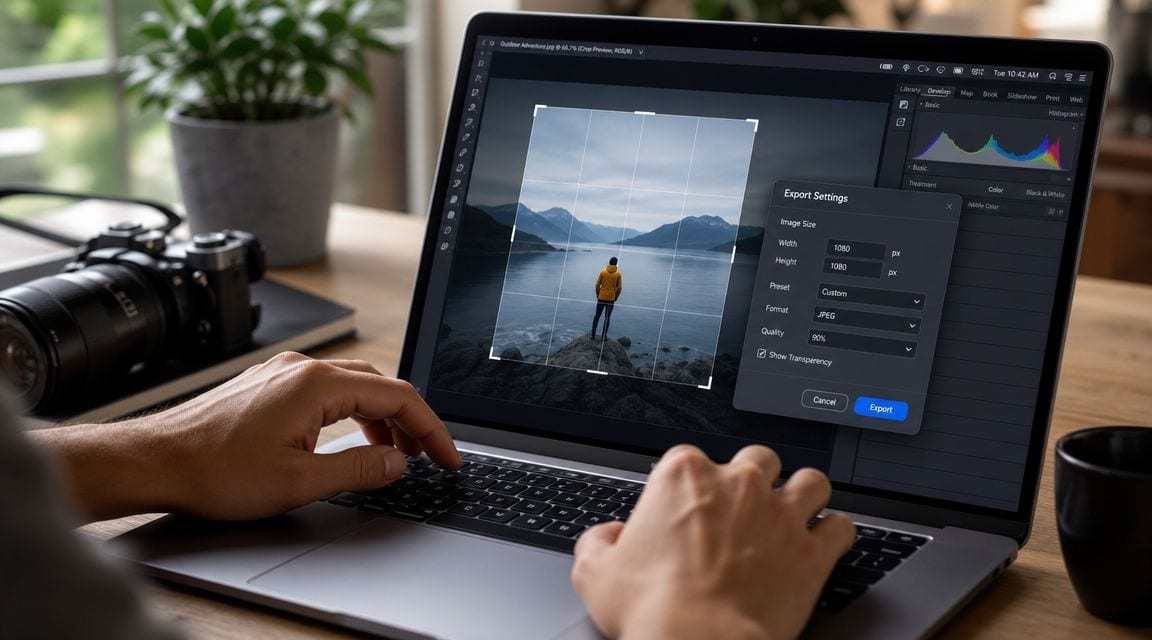
Buffer notes that 1080 × 1080 remains the safest cross-device square baseline because it displays consistently and helps reduce subject clipping when assets are auto-centered or reused in profile-grid previews. Their Instagram image size guide is useful on that point.
A simple export workflow
In Canva, start with a custom canvas set to 1080 x 1080. Add your photo or graphic, scale it inside the square, and keep important elements away from the outer edge. Export as JPG for photo-led posts or PNG for graphic-led posts.
In Adobe Express, the process is similar. Create a square canvas first, not a portrait file you plan to trim later. If the post includes text, check it at actual phone-view size before exporting.
For video-first creators repurposing stills or clips into square assets, tools like quso.ai's aspect ratio converter can handle a 1:1 resize workflow alongside other social formats.
The checks that matter before upload
Use this shortlist before posting:
Confirm the canvas: It should be square from the start, not square by accident.
Preview the focal point: Faces, products, and headlines should stay centered comfortably.
Export once: Re-exporting the same asset repeatedly tends to degrade quality.
Match file type to design: JPG for photos, PNG for sharper graphic elements.
If you want a quick visual walkthrough, this demo covers the kind of cropping and formatting process creators use when preparing square assets:
The biggest win with square is predictability. Once your team locks in a standard canvas, a safe margin, and a file-type rule, square posts become one of the fastest formats to produce reliably.
FAQ on Instagram Image Dimensions
What are the dimensions for a square video post
Use a 1:1 square format for a square video post so the width and height match. Keep the visual composition centered and avoid placing important text too close to the edges.
Do all images in a carousel post have to be square
No. Carousel posts don't have to be square. What matters in practice is consistency. If you mix shapes without planning, Instagram may crop or pad slides in ways that make the carousel feel uneven. The cleanest approach is to prepare all slides to the same format before upload.
Are Instagram Story dimensions different from feed posts
Yes. Stories use a vertical full-screen format, while feed posts can be square, portrait, or horizontal. That means you shouldn't repurpose a feed image into Stories without checking how the composition holds up in a taller frame.
If you work across feed posts, Stories, carousels, and short-form video, the easiest way to stay consistent is to build one repeatable content workflow instead of resizing manually every time. quso.ai helps creators and teams plan, repurpose, resize, and schedule social content from one dashboard, which is useful when the same core asset has to be adapted for multiple Instagram placements.