YouTube Thumbnail Size: The Complete 2026 Guide & Specs
YouTube thumbnail size is 1280 x 720 pixels, with a 16:9 aspect ratio, under 2MB, as a JPG or PNG file. The minimum width is 640 pixels.
Those specs get your file accepted. They do not get the click.
What moves CTR is whether the thumbnail stays readable at small sizes, matches the promise of the title, and sets the right expectation for the first 30 seconds of the video. I have seen clean, simple 1280 x 720 thumbnails outperform more detailed designs because the winning version survived compression, mobile scaling, and YouTube’s crowded homepage.
The practical trade-off is simple. Higher detail gives you more room to work with, but too much detail usually hurts performance once the image is reduced to a tiny rectangle. The best thumbnails are built for clarity first, then exported to spec. That is where size stops being a compliance checkbox and starts affecting clicks, watch time, and how often YouTube keeps testing your video with new viewers.
Table of Contents
- Your Guide to the Perfect YouTube Thumbnail Size in 2026
- YouTube Thumbnail Specs A Quick Reference
- Designing a Thumbnail That Gets Clicks
- Beyond 720p Why You Should Consider 4K Thumbnails
- Standard Video Thumbnails vs Shorts Thumbnails
- Common Thumbnail Mistakes and How to Avoid Them
- Your Final Thumbnail Export Checklist
- Frequently Asked Questions
Your Guide to the Perfect YouTube Thumbnail Size in 2026
The default YouTube thumbnail size for standard videos is still 1280 x 720 pixels. Keep it in 16:9, stay under 2MB for mobile uploads, and export in JPG, PNG, or GIF if you want reliable compatibility across YouTube surfaces, based on the long-standing guidance summarized by ShortGenius (thumbnail size guide).
That’s the baseline. It works because YouTube displays thumbnails in a lot of small placements: home feed, suggested videos, search, subscriptions, and mobile recommendations. The platform also compresses and scales images, so tiny details, thin text, and low-contrast layouts usually fall apart.
Practical rule: Design the thumbnail for the smallest version first, not the full-size canvas in your editor.
If you remember only three things, remember these:
- Use the full recommended size: 1280 x 720 gives YouTube enough resolution to scale cleanly.
- Keep the message simple: One visual idea beats a busy collage.
- Make it readable at a glance: If the title treatment disappears on mobile, the thumbnail isn’t finished.
The technical spec gets you accepted. The design choices get you clicked.
YouTube Thumbnail Specs A Quick Reference
If you just need the upload settings, use this table and move on.
| Specification | Requirement |
|---|---|
| Recommended Dimensions | 1280 x 720 pixels |
| Aspect Ratio | 16:9 |
| Minimum Width | 640 pixels |
| Maximum File Size | Under 2MB |
| Accepted File Formats | JPG, PNG, GIF, BMP |
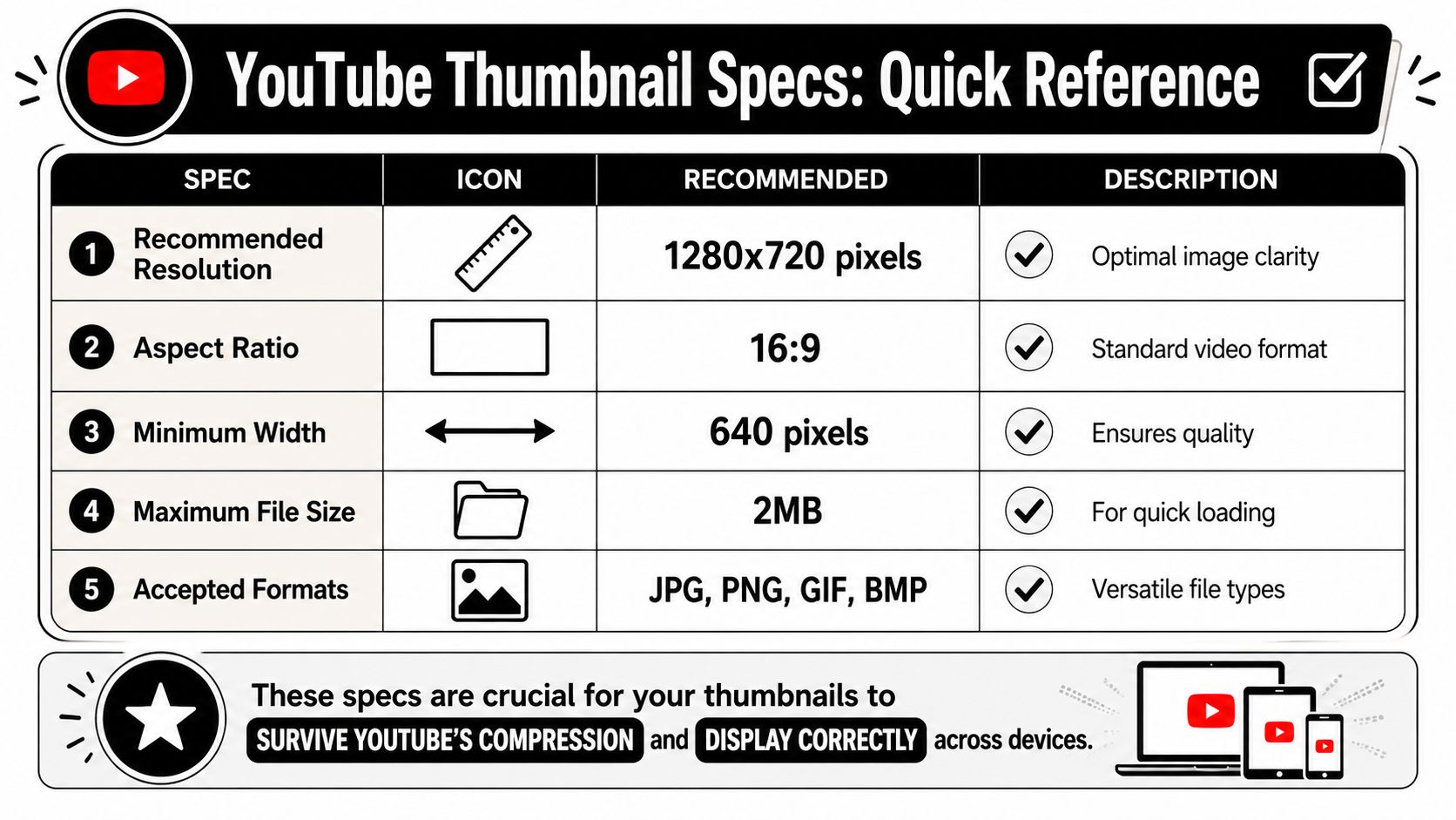
The important part isn’t just meeting the spec. It’s surviving YouTube’s display behavior. Lower-resolution images can look fine in your design tool, then turn soft once YouTube scales them up or recompresses them.
A few format choices matter in practice:
- JPG for photo-heavy thumbnails: Usually the safest choice for screenshots, portraits, and realistic imagery.
- PNG for text and logos: Better when your layout depends on crisp edges.
- BMP only if needed: It’s listed in the article requirements here, but most creators will stick with JPG or PNG for easier workflow.
If you manage multiple platforms, keep a separate reference sheet for every network. This social media image sizes guide is useful for that.
Designing a Thumbnail That Gets Clicks
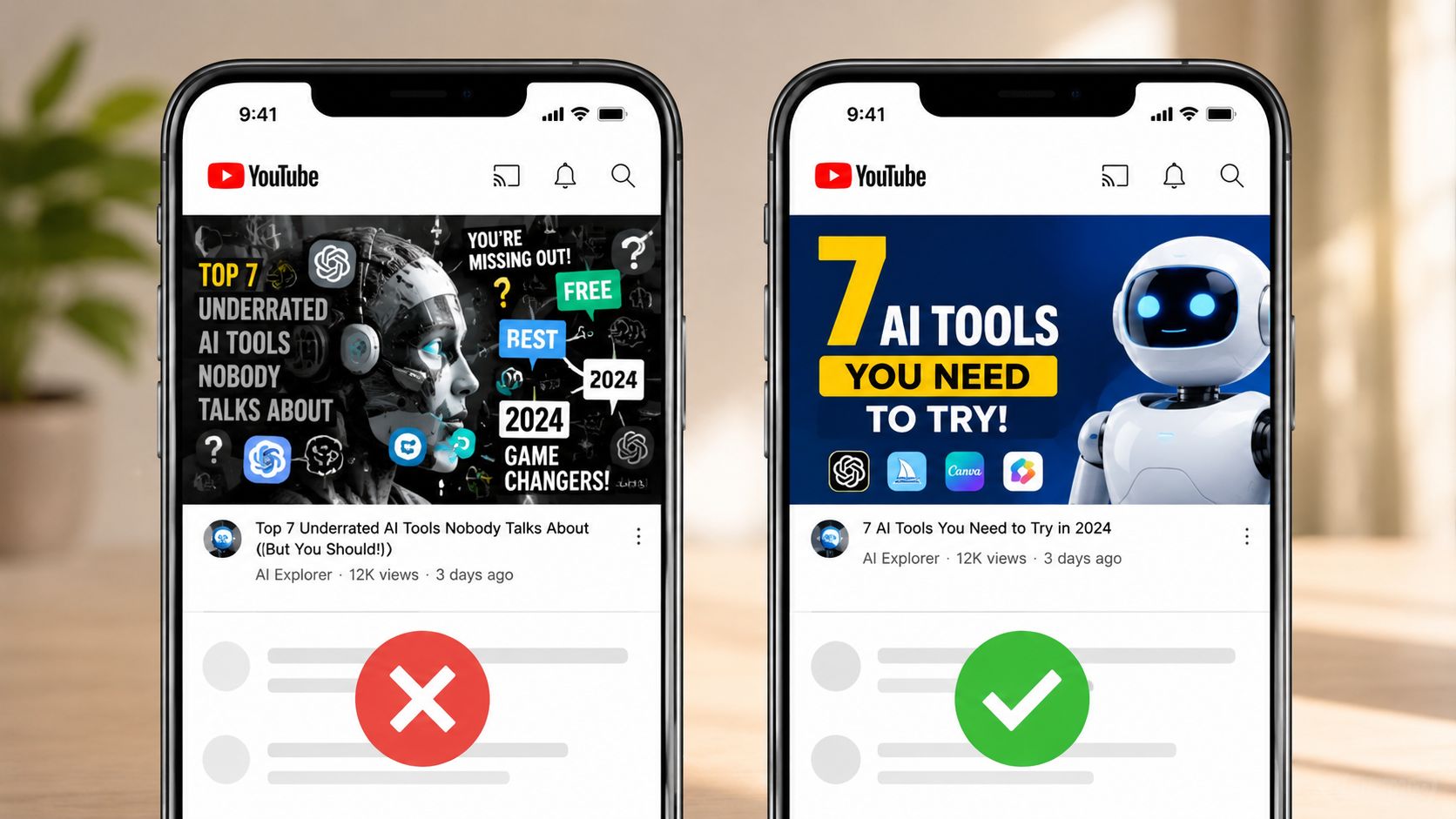
Clicks usually rise before design awards do.
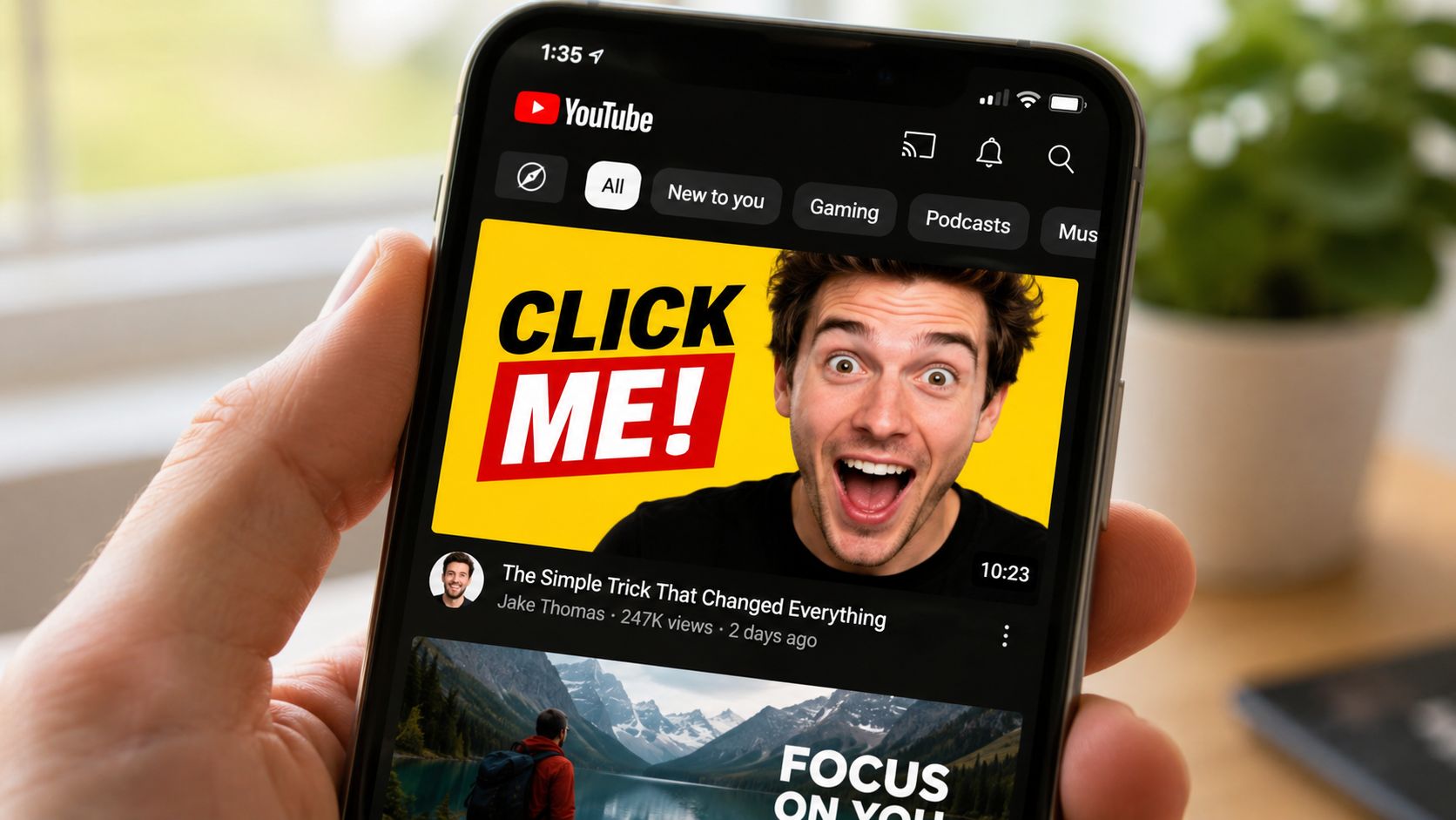
A high-performing thumbnail does one job fast. It makes the topic instantly legible at a glance, on a phone feed, desktop sidebar, or TV recommendation row. The creators who miss this usually design at full canvas size, then wonder why CTR stalls once YouTube shrinks everything down.
Start with recognition speed.
If the idea is not clear in one second, the thumbnail is carrying too much information. In practice, the strongest performers usually rely on one obvious subject, one clear contrast pattern, and text that can survive being reduced to a tiny card.
What actually holds up on YouTube
Use this review pass before you publish:
- Lead with contrast: Subject and background need separation immediately. If they blend together, scroll speed wins.
- Keep text brutally short: Three to five words is usually enough. More than that often lowers readability and weakens the visual hierarchy.
- Choose one focal point: A face, product, chart, result, or object. Pick one primary story element and let it dominate.
- Use heavy type and simple shapes: Thin strokes, fine outlines, and small UI details disappear first.
- Design for curiosity, not completeness: The thumbnail should promise the outcome or tension. The video handles the explanation.
Color discipline matters too. Two or three dominant colors usually outperform busy layouts because they help viewers parse the image faster. That speed matters. Faster recognition improves click-through rate, and better click alignment usually improves watch time because the viewer gets what the thumbnail promised.
Faces are a format choice, not a universal rule
Face thumbnails work well when the emotional reaction is the hook. They are less useful when the value is specific, visual, and outcome-driven.
Earlier source material in this article noted a pattern many operators already see in channel tests. Educational content often performs better with diagrams, product screenshots, before-and-after visuals, or a bold result frame. Entertainment and personality-led videos often benefit from expressive faces because emotion carries the click faster.
The trade-off is simple. Faces create emotional speed. Objects, interfaces, and results create informational speed. Pick the one that matches why someone would watch.
I usually test this question before final export: would a new viewer care more about the person, or the payoff?
If the payoff wins, show the proof. If the personality wins, show the face.
Higher-resolution artwork can help here too, especially when your layout includes interface elements, fine text, or layered compositions. Using a 4K resolution thumbnail format does not fix a weak concept, but it does preserve clarity better across larger screens and aggressive platform scaling.
If you’re testing variants, use a real process instead of swapping files based on instinct. This guide to A/B testing best practices is worth reviewing if you want cleaner experiments.
Later in your workflow, a visual reference can help reset your eye before exporting:
Beyond 720p Why You Should Consider 4K Thumbnails
The old standard still works. But it’s no longer the whole story.
YouTube’s updated thumbnail guidance for 2026 recommends 3840 x 2160 pixels, keeps the 16:9 aspect ratio, and sets device-based file limits of 2MB for mobile uploads and 50MB for desktop uploads, according to the KDCC summary of the update (YouTube thumbnail size update). That change exists for a reason. More YouTube viewing happens on larger displays now, and soft thumbnails look worse on TVs than they do on phones.
Where higher resolution actually matters
If your team publishes long-form video in high resolution, a 4K thumbnail is worth considering as a future-proof default. It gives you more headroom for sharper text, cleaner edges, and less visible artifacting on large screens.
There’s also performance evidence behind it. Based on analysis of 170K+ posts across 1,100+ creators, higher-resolution uploads from 1920 x 1080 to 3840 x 2160 improved CTR by 8.2% on Smart TV analytics in the iHitTheButton analysis (higher-res YouTube thumbnail performance).
That doesn’t mean every creator should cram more detail into the image. It means the same simple composition can render more cleanly on high-density displays.
Operator takeaway: Use higher resolution to preserve clarity, not to add complexity.
If you work in paid and organic video, the same principle shows up in ad creative too. This piece on the importance of quality media in advertising makes the broader quality argument well. If 4K terms still get mixed up internally, this short explainer on 4K resolution is a useful reference.
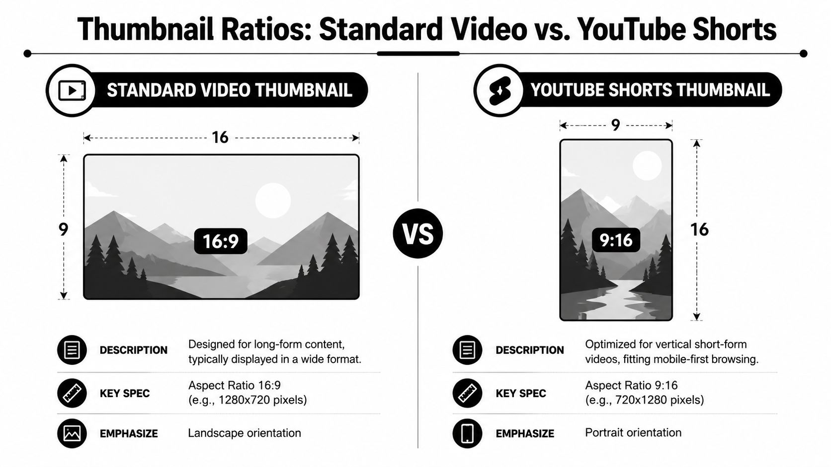
Standard Video Thumbnails vs Shorts Thumbnails
Standard YouTube videos and YouTube Shorts do not use the same thumbnail logic.
For standard videos, you’re working in 16:9. For Shorts, the thumbnail must be 1080 x 1920 pixels with a 9:16 aspect ratio, and text or faces should avoid the bottom 15 to 20% and outer edges to prevent interface overlap, based on MiraFlow’s 2026 guide (YouTube Shorts thumbnail size).
Safe zones matter more on Shorts
Shorts are less forgiving because the UI sits on top of the frame. If your headline sits too low, the interface can cover it. If your face is too close to the edge, it competes with platform controls.
Use these placement rules:
- Keep key text centered: Don’t anchor important copy near the bottom.
- Pull faces inward: Leave breathing room around the subject.
- Avoid edge-to-edge design: Decorative borders and corner elements often get clipped or crowded.
If Shorts are part of your publishing mix, this guide to YouTube Shorts dimensions, durations, and mistakes to avoid is worth bookmarking.
Common Thumbnail Mistakes and How to Avoid Them
Bad thumbnails usually fail in layers. The image is busy. The text is too small. The focal point is weak. Each problem looks minor on its own, but together they drag down click-through rate and usually hurt watch time too, because the people who do click are often the wrong viewers.
The mistakes that keep showing up
- Tiny text: If the message only works at full size, it will fail on mobile and in suggested feeds. Cut the copy hard. Three to five words usually beats a sentence.
- Low contrast: Text disappears fast against detailed photos and mid-tone backgrounds. Put text over a darker shape, blur the background slightly, or swap the image for one with a cleaner subject edge.
- Too many ideas: A face, logo, screenshot, arrow, badge, chart, and headline in one frame does not look informative. It looks undecided. Build the thumbnail around one promise, then remove anything that does not support it.
- Weak subject hierarchy: Viewers should know where to look first in under a second. If the face, object, and text all compete equally, none of them wins.
- Ignoring overlay zones: The timestamp can crowd the lower-right corner on standard thumbnails. Important visual details placed there often get covered or compressed.
I have seen one trade-off come up over and over in testing. Teams try to say everything in the thumbnail so the video feels “clearer.” CTR usually drops when they do. The better performer is often the simpler version with one strong visual cue and a headline that creates a specific gap the title closes.
Another mistake shows up at scale. Inconsistency.
If a channel cuts one long video into several clips, thumbnail quality drifts fast unless the system is tight. One thumbnail uses bold contrast, the next uses thin text, the next adds three competing elements. That weakens recognition across Home, Search, and Suggested because the channel stops looking like a consistent product.
The fix is operational, not just visual:
- Lock one or two fonts
- Use a limited color system
- Reserve one visual zone for text
- Keep one focal subject per thumbnail
That structure speeds production and tends to improve results because each new thumbnail starts from a proven layout instead of a blank canvas. If you’re turning long videos into multiple cutdowns, a repeatable content workflow matters just as much as the thumbnail itself. This video repurposing guide is a solid place to tighten that process.
Your Final Thumbnail Export Checklist
Use this before every upload.
- Canvas size: Export at 1280 x 720 for standard videos, or higher if you’re intentionally using a higher-res workflow.
- Aspect ratio: Keep it at 16:9 for standard video thumbnails.
- Format choice: Use JPG for photo-heavy images. Use PNG when text, shapes, or logos need extra clarity.
- File weight: Keep it under 2MB when you need mobile-safe compatibility.
- Legibility check: Zoom out until the thumbnail is small. If the core message disappears, revise it.
- Safe placement: Don’t put critical elements in edge zones or near likely UI overlays.
- Naming: Give the file a descriptive name like youtube-thumbnail-size-guide.jpg so your asset library stays organized.
Export is the last chance to catch a weak thumbnail before YouTube does what it always does: shrink it.
Frequently Asked Questions
What is the difference between a YouTube thumbnail and a channel banner?
A thumbnail is the click image for an individual video. A channel banner is the header art for your channel homepage. They use different sizes, different layouts, and different jobs.
Can I change my YouTube thumbnail after publishing?
Yes. You can update the custom thumbnail after the video is live. That’s a normal optimization move if a video underperforms.
Does YouTube compress my thumbnail?
Yes. In practice, YouTube scales and compresses images for different placements, which is why clean composition and strong legibility matter more than fine detail.
What is the best thumbnail size for mobile?
For standard YouTube videos, 1280 x 720 is still the safest default because it scales down cleanly. The core mobile issue isn’t a separate size. It’s whether your text and focal point stay readable when the image gets small.
What size should I use for YouTube Shorts thumbnails?
Use 1080 x 1920 with a 9:16 layout, and keep text or faces away from the bottom area and outer edges so the Shorts interface doesn’t cover them.
If you’re turning long videos into clips for YouTube, Shorts, and the rest of your social calendar, quso.ai helps you repurpose footage, add captions, and schedule faster so you can spend more time on the thumbnail decisions that affect clicks.