Color Psychology: How To Use it in Marketing and Branding
Have you ever wondered why some brands just stick in your mind? Why you feel instantly drawn to certain logos or packaging, while others fade into the background? The truth is, it’s not just about clever slogans or flashy designs—it’s about color psychology.
And if your business isn’t leveraging the power of color, you could be missing out on a huge opportunity to connect with your audience, build trust, and drive action. Imagine losing potential customers simply because your branding doesn’t evoke the right emotions or align with their subconscious preferences. Frustrating, right?
But don’t worry—there’s a solution. By understanding how color psychology works and applying it strategically to your marketing and branding, you can create a visual identity that resonates deeply with your target audience. In this blog, we’ll break it all down for you, so you can start using color to your advantage and watch your business thrive.
What is Color Psychology?
Simply put, color psychology is the study of how colors influence human behavior, emotions, and decision-making. Think of it as the secret language of colors—one that speaks directly to your customers’ subconscious minds.
For example, have you ever noticed how fast-food chains like McDonald’s or Burger King use red and yellow in their branding? That’s no accident. Red triggers excitement and urgency, while yellow evokes feelings of happiness and optimism. Together, they create a sense of energy and appetite appeal—perfect for grabbing attention and encouraging quick decisions.
But here’s the thing: color psychology isn’t just about picking pretty shades. It’s about understanding how different hues can impact the way people perceive your brand. Whether it’s calming blues that build trust, vibrant oranges that spark creativity, or sophisticated blacks that convey luxury, every color has a unique psychological effect.
For your business, this means the colors you choose for your logo, website, packaging, and even your social media posts can make or break how your audience feels about you. Get it right, and you’ll create a strong emotional connection. Get it wrong, and you might send the wrong message entirely.
So, before you settle on a color palette, it’s worth taking the time to understand what each color represents and how it aligns with your brand’s personality and goals.
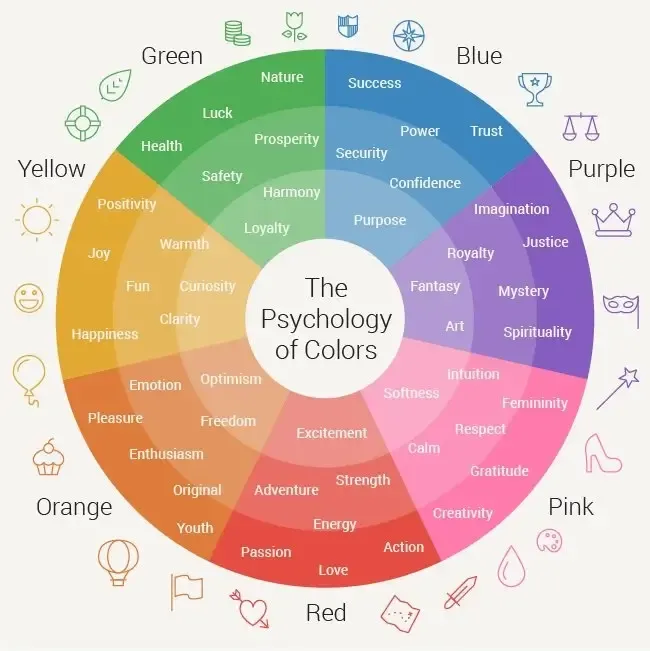
Source: Wordstream
How to Use Color Psychology in Marketing and Branding
Now that you know what color psychology is, let’s talk about how you can actually use it to boost your marketing and branding efforts. The key here is to be intentional—every color choice should align with your brand’s message, values, and target audience. Here’s how you can make it work for your business:
1. Define Your Brand Personality
Before picking colors, ask yourself: What does your brand stand for? Are you fun and playful? Professional and trustworthy? Luxurious and sophisticated? Your color palette should reflect your brand’s personality. For example:
- Blue is perfect for brands that want to convey trust, calmness, and reliability (think banks or tech companies).
- Yellow works well for brands that want to appear cheerful, energetic, and approachable (like brands targeting younger audiences).
- Black is ideal for luxury brands that want to exude elegance and exclusivity.
2. Understand Your Audience
Different colors resonate with different demographics. For instance, younger audiences might respond better to bold, vibrant colors, while older audiences may prefer more subdued tones.
Consider cultural differences too—colors can have different meanings in different parts of the world. For example, white symbolizes purity in Western cultures but is associated with mourning in some Eastern cultures.
3. Use Colors to Evoke Emotions
Think about the emotions you want to evoke in your customers. Are you trying to create a sense of urgency? Use red. Want to inspire trust and security? Go for blue. Looking to promote creativity and innovation? Purple might be your best bet. Use these emotional triggers in your logo, website design, social media posts and even your call-to-action buttons.
💡 Dive into our blog: The Ultimate Guide to Color Theory to create palettes that boost your brand and captivate your audience!
4. Create Consistency Across All Platforms
Your brand’s colors should be consistent across every touchpoint—your website, social media, packaging, and even your physical store (if you have one). Consistency builds recognition and trust. When customers see your colors, they should immediately think of your brand.
5. Test and Optimize
Don’t be afraid to experiment! A/B test different color schemes in your marketing campaigns to see what resonates best with your audience. For example, try changing the color of your “Buy Now” button and see if it impacts conversion rates. Small tweaks can lead to big results.
6. Pair Colors Strategically
It’s not just about individual colors—it’s also about how they work together. Complementary colors (like blue and orange) create contrast and grab attention, while analogous colors (like green and yellow) create harmony and balance. Use these combinations to make your designs visually appealing and effective.
By using color psychology strategically, you can create a brand that not only looks great but also connects with your audience on a deeper level. Remember, your colors are more than just aesthetics—they’re a powerful tool to influence how people feel about your business.
Let’s explore how brands evoke emotions through the use of color in their logos—complete with a visual breakdown!
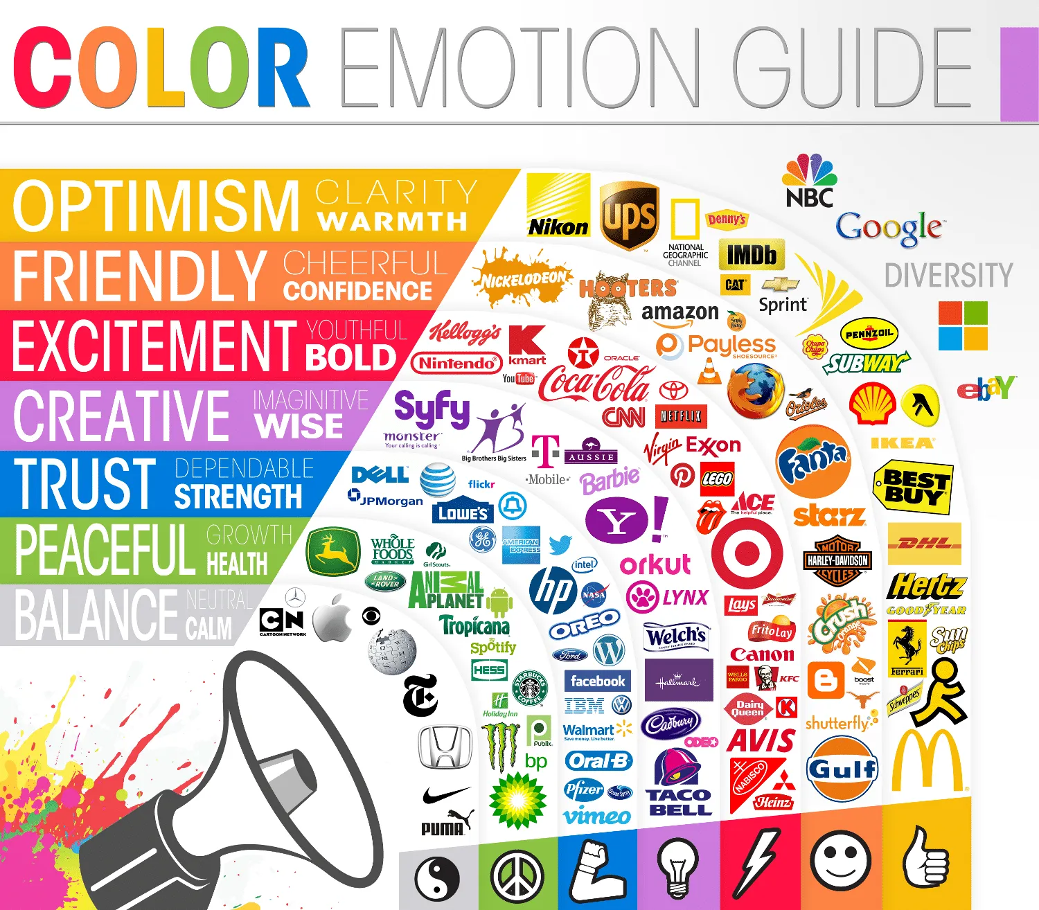
Source: Thelogocompany
Color Breakdowns
Now that you know how to use color psychology, let’s break down the meanings and applications of some key colors. This will help you choose the right shades for your brand and ensure they align with the emotions and messages you want to convey.
1. Red
What it represents: Energy, excitement, passion, urgency.
Best for: Brands that want to grab attention and create a sense of urgency (think clearance sales or fast food).
Use it in: Call-to-action buttons, promotional banners, or logos for bold, dynamic brands.
Example: Coca-Cola uses red to evoke excitement and appetite appeal.
2. Blue
What it represents: Trust, calmness, reliability, professionalism.
Best for: Brands in finance, tech, healthcare, or any industry where trust is key.
Use it in: Logos, websites, and branding materials to build credibility.
Example: Facebook and LinkedIn use blue to promote trust and communication.
3. Yellow
What it represents: Happiness, optimism, warmth, creativity.
Best for: Brands that want to appear friendly, approachable, and youthful.
Use it in: Packaging, social media posts, or logos to create a cheerful vibe.
Example: McDonald’s uses yellow to evoke feelings of happiness and energy.
4. Green
What it represents: Growth, health, nature, sustainability.
Best for: Eco-friendly brands, wellness companies, or businesses in the food and agriculture industry.
Use it in: Logos, product packaging, or marketing materials to emphasize natural or organic qualities.
Example: Whole Foods uses green to highlight its focus on fresh, natural products.
5. Orange
What it represents: Enthusiasm, creativity, fun, affordability.
Best for: Brands that want to appear playful, energetic, and approachable.
Use it in: Call-to-action buttons, logos, or promotional materials to create a sense of excitement.
Example: Fanta uses orange to reflect its fun and vibrant personality.
6. Purple
What it represents: Luxury, creativity, spirituality, sophistication.
Best for: High-end brands, beauty products, or businesses in the creative industry.
Use it in: Logos, packaging, or branding materials to convey elegance and exclusivity.
Example: Cadbury uses purple to emphasize its premium quality.
7. Pink
What it represents: Playfulness, romance, femininity, compassion.
Best for: Brands targeting a younger or female audience, or those in the beauty and fashion industry.
Use it in: Packaging, social media campaigns, or logos to create a soft, inviting feel.
Example: Barbie uses pink to reinforce its playful and feminine brand identity.
8. Black
What it represents: Sophistication, power, elegance, mystery.
Best for: Luxury brands, high-end products, or businesses that want to appear sleek and modern.
Use it in: Logos, packaging, or websites to create a sense of exclusivity and sophistication.
Example: Chanel uses black to convey timeless elegance and luxury.
9. White
What it represents: Simplicity, purity, cleanliness, minimalism.
Best for: Brands that want to appear modern, clean, and minimalist.
Use it in: Websites, packaging, or logos to create a sense of openness and clarity.
Example: Apple uses white to emphasize simplicity and innovation.
10. Brown
What it represents: Stability, warmth, earthiness, reliability.
Best for: Brands in the food, coffee, or outdoor industries, or those with a rustic, natural vibe.
Use it in: Packaging, logos, or branding materials to create a sense of warmth and authenticity.
Example: UPS uses brown to convey reliability and dependability.
By understanding the meanings behind these colors, you can make smarter choices for your brand and create a visual identity that truly resonates with your audience.
Leverage Color Psychology to Transform Your Brand
Color psychology is more than choosing a color palette—it’s about understanding the emotional and psychological impact those colors have on your audience. Now that you know how colors influence perceptions and drive decisions, it’s time to start doing it for your brand.
Use colors to tell your story, connect with your audience, and stand out in a crowded market. Whether it’s revamping your logo, redesigning your website, or planning your next social media campaign, make every color choice intentional.
Need help bringing your ideas to life? Log in or sign up to quso.ai and kickstart your content creation journey!